 IMAGE #54 of 70
IMAGE #54 of 70
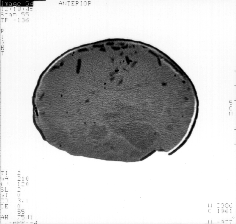
There are a number of interesting patterns within the slices (images) that may be representative of a dinosaur embryo. For example, if you look at the image above, you may notice a blurry, 'blobby' area of slightly darker matter at the right of the image. This coloring does appear in many of the images and sparked interest immediately. However, it doesn't seem to have a coherent shape and because of the grey coloring it would be very tricky to filter out only this portion of the image. In their book, "Dinosaur Eggs and Babies," Carpenter and Hirsch present a very similar CT scanned image and note that if an embryo were present, it would be represented by the darkest parts of the image, those that match the color of the shell. So I turned my attention to the thin black pieces seen at the left side of the image.
There were a number of factors that made filtering out only the darkest pieces difficult. First, many of the images contain black specks that appear for one slide only, are very small, and cannot possibly represent shell or bone. There were also scratches across some of the images. In order to eliminate these errors, I mathematically clipped out certain areas from each image both inside and outside the egg matter.
The biggest difficulty encountered in trying to filter out only the shell and bone came as a result of differences in the overall brightness of each image.
If you look at the first of the slide animations, which presents all of the original images, you will notice as the animation plays that the brightness varies significantly between images (It reminds me of one of the old black and white newsreels).
Animation: The Originals
(i.e. "Pan Through Egg on X-Axis")
In addition to looking at these images from this view, we can pan through the images from the top and from the side (The images are aligned on the x-axis in 3D space). I used Data Explorer to a three dimensional interpolation between slices. The results are in the following animations:
After performing this correction, the brightness across the images, though markedly less dramatic, was still inconsistent. Although the difference in brightness across the images was most likely the result of a periodic event (during the CT scanning process), it now appeared that the data did not possess a strictly regular error function.
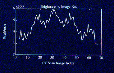
I analyzed the data more closely by taking a color gradient across a square section of gray matter (a bit left of center in most cases) to find an average brightness within the slice and plotting this in Matlab. The results of this operation are presented in the figure below.
Using the same module I had constructed to determine a color gradient, I constructed a program that individually adjusted the brightness of each image according to the relation beteen the image's gradient value and the average gradient value for all of the slices. Thus, this program used the color information specific to each image rather than the formula generated information from the sine wave approach mentionned above and greatly redulced the differences in brightness between slides. The corrected brightness animation presents the images as corrected by this process.
Animation: Corrected Brightness
If you compare this animation with the former animation that pans through the images along the x axis (" The Originals "), you will notice that the dramatic flickering that appeared before has now disappeared.
However, when it came time to create a three-dimensional surface from these images, using Data Explorer's "isosurface" module, the corrected images were still not clear enough. In attempting to filter out only shell and bone, I encountered problems such as the one presented in figure 3 below.


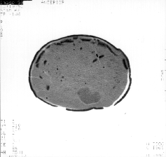
These two consecutive images were passed through the same filter. By 'filter,' I mean that the points that appear in white passed through a module that specified a very particular range of colors. Notice the difference in the amount of 'gunk' that passed through the filter for each image. While the image at the left is virtually free of cloudiness and speckles, the image on the right is a mess. These extra spots in the image at the right appear because the original image was darker than that of the image at the left. As a result, more pixels have a color that falls within the range specified by the filter and the image is much cloudier.
The solution to this problem was a messy, time consuming hack. I went through all 70 images individually and specified an appropriate color range in order to best select only shell and bone. Most filtered images still contained small specks that could not represent either shell or bone and would only serve to cloud the processed 3D image in the end. These I had to clip out by specifying areas of the image for which all pixels should be black. This took me three days in the lab, but I think the results were worth the effort and can be viewed in the animations of shell and bone presented in the visualization section of my report.
 HISTORY OF THE PROJECT
PALEONTOLOGY
THE PROCESS
IMAGING
3D ANIMATIONS
CONCLUSIONS
REFERENCES
 DINO HOME PAGE