This page will simply show all of the graphs that MolterNetwork.m prints. Each graph will have a brief description above it. The implications of each graph will be explained in the Discussion section next. The discussion section will not display the images themselves, but it will link to them.
Figure 1 plots the phase of each LFP with time on the same graph.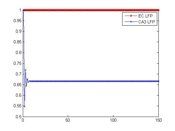
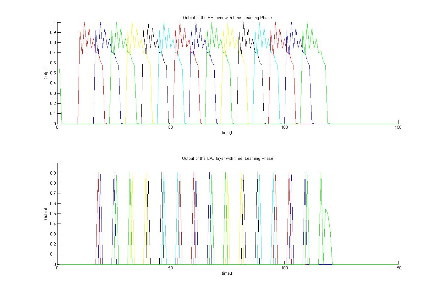
Figure 2 plots the output of each phase with time during the learning phase. Each cell is depicted as a different color.
Figures 3 and 4 are Rastor plots of the outputs during the learning phase
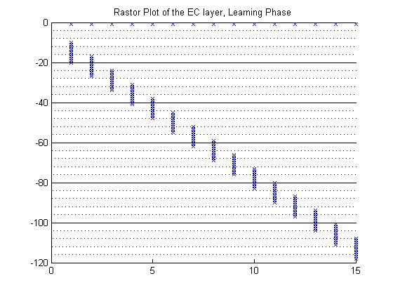
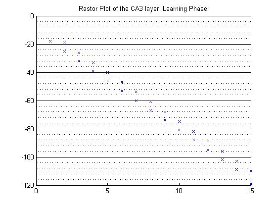
Figure 5 plots the output of each phase with time during the reactivation phase. Again, each cell is depicted as a different color.
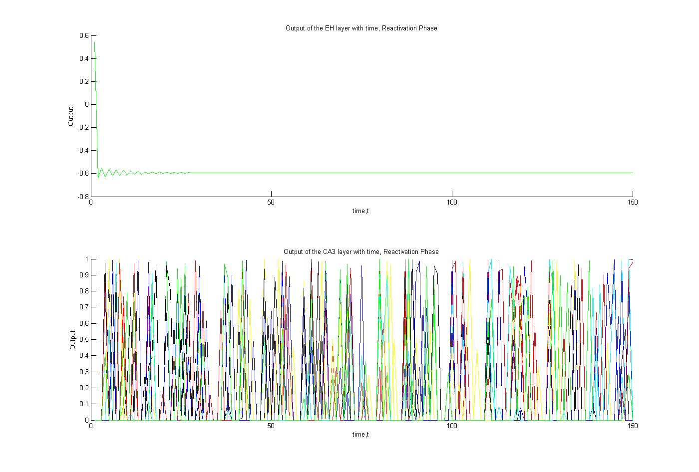
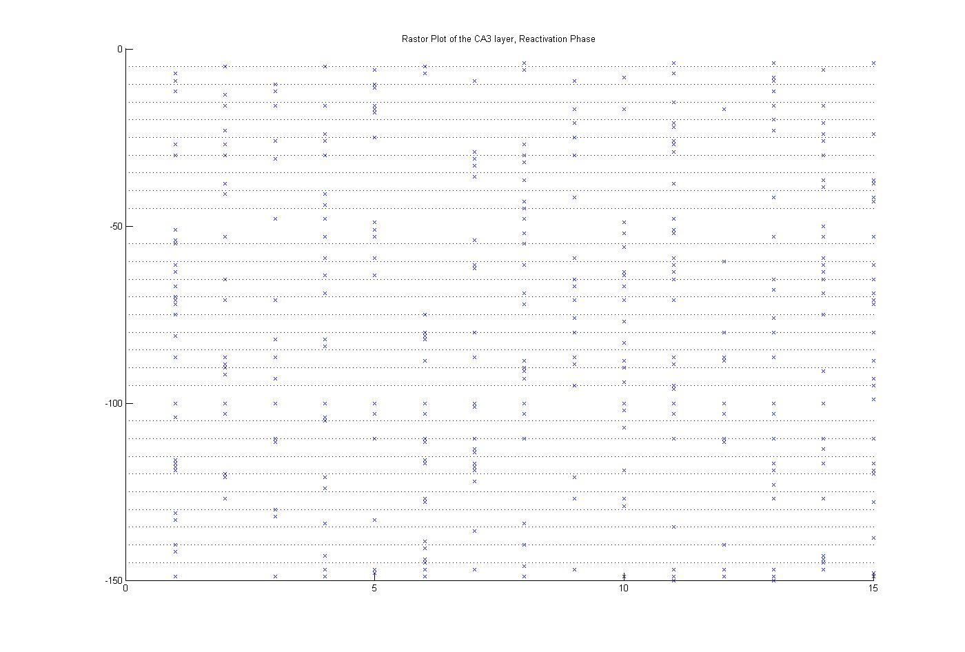
Figure 6 is a Rastor plot of the CA3 cells during reactivation.